ggraph 可用于 网络、图和树状 数据结构的可视化。它扩展了 ggplot2 的 geoms,facets 等功能,并且添加了对 layouts 语法的支持。
先看一个简单的例子。
library(ggraph)## 载入需要的程辑包:ggplot2library(tidygraph)##
## 载入程辑包:'tidygraph'## The following object is masked from 'package:stats':
##
## filter# Create graph of highschool friendships
graph <- as_tbl_graph(highschool) %>%
mutate(Popularity = centrality_degree(mode = 'in'))这个数据(highschool)包含了学校成员之间的联系。第一列是一个人(from),第二列是另一个人(to),第三列是这个连接(edge)的属性。
highschool## from to year
## 1 1 14 1957
## 2 1 15 1957
## 3 1 21 1957
## 4 1 54 1957
## 5 1 55 1957
## 6 2 21 1957
## 7 2 22 1957
## 8 3 9 1957
## 9 3 15 1957
## 10 4 5 1957
## 11 4 18 1957
## 12 4 19 1957
## 13 4 43 1957
## 14 5 19 1957
## 15 5 43 1957
## 16 6 13 1957
## 17 6 20 1957
## 18 6 22 1957
## 19 7 17 1957
## 20 8 14 1957
## 21 8 17 1957
## 22 9 12 1957
## 23 9 20 1957
## 24 9 21 1957
## 25 9 22 1957
## 26 9 51 1957
## 27 11 19 1957
## 28 11 50 1957
## 29 11 52 1957
## 30 11 53 1957
## 31 12 20 1957
## 32 12 21 1957
## 33 12 22 1957
## [ reached 'max' / getOption("max.print") -- omitted 473 rows ]在生成图(graph)之后,计算了节点(node)的 centrality。
graph## # A tbl_graph: 70 nodes and 506 edges
## #
## # A directed multigraph with 1 component
## #
## # Node Data: 70 x 2 (active)
## name Popularity
## <chr> <dbl>
## 1 1 2
## 2 2 0
## 3 3 0
## 4 4 4
## 5 5 5
## 6 6 2
## # ... with 64 more rows
## #
## # Edge Data: 506 x 3
## from to year
## <int> <int> <dbl>
## 1 1 13 1957
## 2 1 14 1957
## 3 1 20 1957
## # ... with 503 more rows这样的一个 graph 含有 70 个节点,506 条边,是一个有向图(directed)。Node 的属性 Popularity 是刚刚上面计算的,edge 的属性是 highschool 数据框本来就有的。
使用 ggraph 等函数可以将这个一个图可视化。
# plot using ggraph
ggraph(graph, layout = 'kk') +
    geom_edge_fan(aes(alpha = stat(index)), show.legend = FALSE) +
    geom_node_point(aes(size = Popularity)) +
    facet_edges(~year) +
    theme_graph(foreground = 'steelblue', fg_text_colour = 'white')
## Warning in grid.Call(C_stringMetric, as.graphicsAnnot(x$label)): Windows字体数据
## 库里没有这样的字体系列## Warning in grid.Call(C_textBounds, as.graphicsAnnot(x$label), x$x, x$y, :
## Windows字体数据库里没有这样的字体系列## Warning in grid.Call(C_stringMetric, as.graphicsAnnot(x$label)): Windows字体数据
## 库里没有这样的字体系列
## Warning in grid.Call(C_stringMetric, as.graphicsAnnot(x$label)): Windows字体数据
## 库里没有这样的字体系列
## Warning in grid.Call.graphics(C_text, as.graphicsAnnot(x$label), x$x, x$y, :
## Windows字体数据库里没有这样的字体系列## Warning in grid.Call(C_textBounds, as.graphicsAnnot(x$label), x$x, x$y, :
## Windows字体数据库里没有这样的字体系列
## Warning in grid.Call(C_textBounds, as.graphicsAnnot(x$label), x$x, x$y, :
## Windows字体数据库里没有这样的字体系列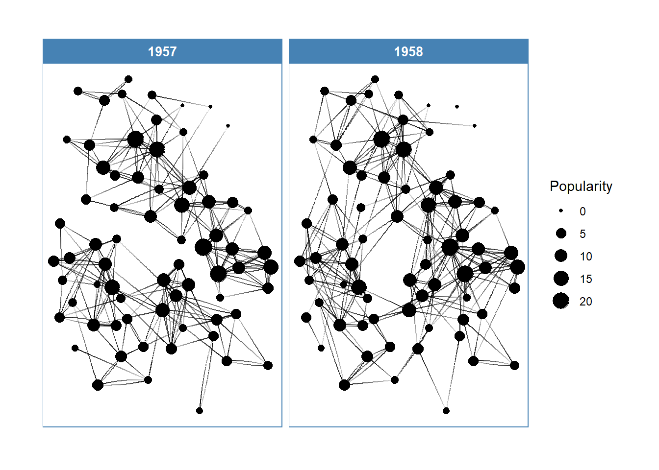
在这里,分两年显示了学生间的亲密关系,与更多人有联系的同学受欢迎程度更大(Popularity),其节点的大小越大。
核心概念
- 布局(The Layouts):定义节点的位置,本质上给出了每个节点在图上的
x,y坐标。ggraph在igraph原有的布局函数上,又添加了一些(如 hive plots,treemaps 和 circle packing)。 - 节点(The Nodes):图上的节点。使用
geom_node_*()函数家族可视化。一些 geoms 适用于特定布局(如geom_node_tile()适用于 treemaps 和 icicle 图形),而另外一些则具有普适性(如geom_node_point()。 - 边(The Edges):是节点之间的连线。使用
geom_edge_*()函数家族可视化,不同的场景下会有不同的边的类型。
Layouts
Source: vignettes/Layouts.Rmd
布局的本质是坐标系中的位置。布局函数所做的事情就是接受一个图的数据结构的输入,计算后输出 xy 坐标。
默认情况下,会调用 auto 布局。
set_graph_style(plot_margin = margin(1,1,1,1))
graph <- as_tbl_graph(highschool)
# Not specifying the layout - defaults to "auto"
ggraph(graph) +
geom_edge_link(aes(colour = factor(year))) +
geom_node_point()## Using `stress` as default layout## Warning in grid.Call(C_textBounds, as.graphicsAnnot(x$label), x$x, x$y, :
## Windows字体数据库里没有这样的字体系列
## Warning in grid.Call(C_textBounds, as.graphicsAnnot(x$label), x$x, x$y, :
## Windows字体数据库里没有这样的字体系列

## Warning in grid.Call(C_textBounds, as.graphicsAnnot(x$label), x$x, x$y, :
## Windows字体数据库里没有这样的字体系列
## Warning in grid.Call(C_textBounds, as.graphicsAnnot(x$label), x$x, x$y, :
## Windows字体数据库里没有这样的字体系列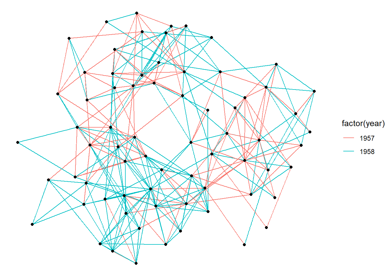
在 ggraph() 指定布局的同时还可以添加参数。
ggraph(graph, layout = 'kk', maxiter = 100) +
geom_edge_link(aes(colour = factor(year))) +
geom_node_point()## Warning in grid.Call(C_textBounds, as.graphicsAnnot(x$label), x$x, x$y, :
## Windows字体数据库里没有这样的字体系列
## Warning in grid.Call(C_textBounds, as.graphicsAnnot(x$label), x$x, x$y, :
## Windows字体数据库里没有这样的字体系列
## Warning in grid.Call(C_textBounds, as.graphicsAnnot(x$label), x$x, x$y, :
## Windows字体数据库里没有这样的字体系列
## Warning in grid.Call(C_textBounds, as.graphicsAnnot(x$label), x$x, x$y, :
## Windows字体数据库里没有这样的字体系列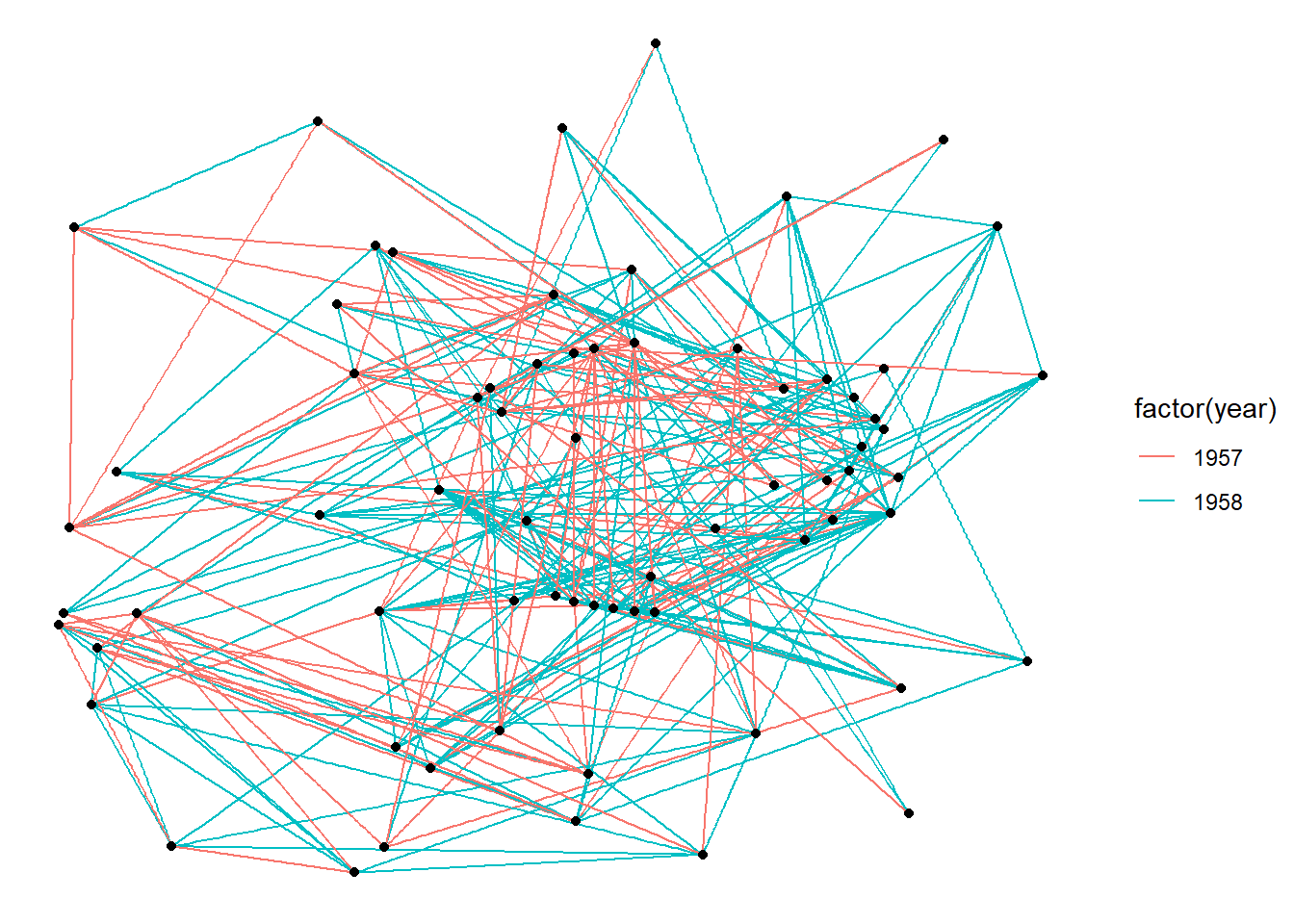
ggraph() 也可以使用预先计算好的布局。这在自定义布局的时候很有用。
layout <- create_layout(graph, layout = 'eigen')## Warning in layout_with_eigen(graph, type = type, ev = eigenvector): g is
## directed. undirected version is used for the layout.ggraph(layout) +
geom_edge_link(aes(colour = factor(year))) +
geom_node_point()## Warning in grid.Call(C_textBounds, as.graphicsAnnot(x$label), x$x, x$y, :
## Windows字体数据库里没有这样的字体系列## Warning in grid.Call(C_textBounds, as.graphicsAnnot(x$label), x$x, x$y, :
## Windows字体数据库里没有这样的字体系列
## Warning in grid.Call(C_textBounds, as.graphicsAnnot(x$label), x$x, x$y, :
## Windows字体数据库里没有这样的字体系列
## Warning in grid.Call(C_textBounds, as.graphicsAnnot(x$label), x$x, x$y, :
## Windows字体数据库里没有这样的字体系列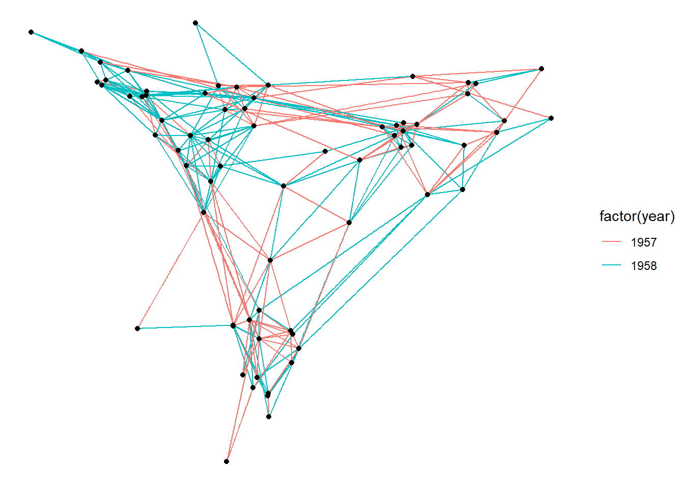
creat_layout() 的结果是一个数据框,包括 node 的位置和属性。当然,图的其它信息也包含在其中。
head(layout)## x y circular name .ggraph.orig_index .ggraph.index
## 1 -0.04317633 -0.15611549 FALSE 1 1 1
## 2 -0.03414457 -0.20843892 FALSE 2 2 2
## 3 -0.04963286 -0.30081095 FALSE 3 3 3
## 4 0.18211675 0.03597610 FALSE 4 4 4
## 5 0.18048193 -0.01111635 FALSE 5 5 5
## 6 0.01389960 -0.19521616 FALSE 6 6 6attributes(layout)## $names
## [1] "x" "y" "circular"
## [4] "name" ".ggraph.orig_index" ".ggraph.index"
##
## $row.names
## [1] 1 2 3 4 5 6 7 8 9 10 11 12 13 14 15 16 17 18 19 20 21 22 23 24 25
## [26] 26 27 28 29 30 31 32 33 34 35 36 37 38 39 40 41 42 43 44 45 46 47 48 49 50
## [51] 51 52 53 54 55 56 57 58 59 60 61 62 63 64 65 66 67 68 69 70
##
## $class
## [1] "layout_tbl_graph" "layout_ggraph" "data.frame"
##
## $graph
## # A tbl_graph: 70 nodes and 506 edges
## #
## # A directed multigraph with 1 component
## #
## # Node Data: 70 x 2 (active)
## name .ggraph.orig_index
## <chr> <int>
## 1 1 1
## 2 2 2
## 3 3 3
## 4 4 4
## 5 5 5
## 6 6 6
## # ... with 64 more rows
## #
## # Edge Data: 506 x 3
## from to year
## <int> <int> <dbl>
## 1 1 13 1957
## 2 1 14 1957
## 3 1 20 1957
## # ... with 503 more rows
##
## $circular
## [1] FALSE这样的一个 数据框 是可以使用常规的 ggplot2 函数来可视化的,不过,还是建议使用 geom_node_*() 系列来操作比较好。
任何数据,只有能够转变为 tbl_graph 对象就可以使用 ggraph 可视化。
几个有意思的图形
分区表
graph <- tbl_graph(flare$vertices, flare$edges)
# An icicle plot
ggraph(graph, 'partition') +
geom_node_tile(aes(fill = depth), size = 0.25) +
geom_node_text(aes(label=shortName))## Warning in grid.Call(C_textBounds, as.graphicsAnnot(x$label), x$x, x$y, :
## Windows字体数据库里没有这样的字体系列
## Warning in grid.Call(C_textBounds, as.graphicsAnnot(x$label), x$x, x$y, :
## Windows字体数据库里没有这样的字体系列## Warning in grid.Call.graphics(C_text, as.graphicsAnnot(x$label), x$x, x$y, :
## Windows字体数据库里没有这样的字体系列## Warning in grid.Call(C_textBounds, as.graphicsAnnot(x$label), x$x, x$y, :
## Windows字体数据库里没有这样的字体系列
## Warning in grid.Call(C_textBounds, as.graphicsAnnot(x$label), x$x, x$y, :
## Windows字体数据库里没有这样的字体系列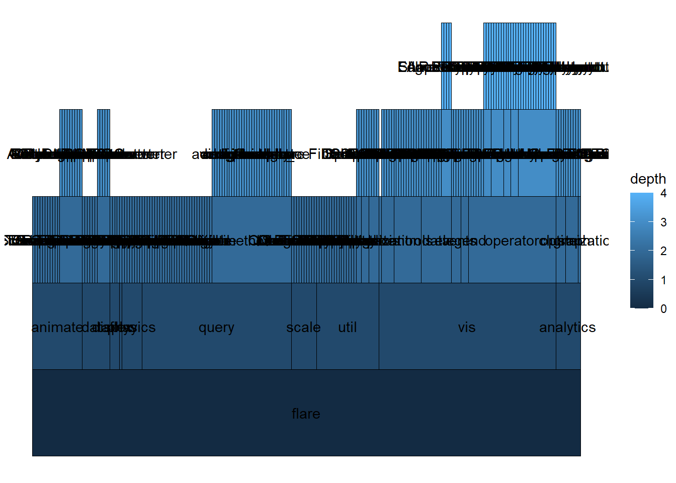
Sunburst plot
# A sunburst plot
ggraph(graph, 'partition', circular = TRUE) +
geom_node_arc_bar(aes(fill = depth), size = 0.25) +
coord_fixed()## Warning in grid.Call(C_textBounds, as.graphicsAnnot(x$label), x$x, x$y, :
## Windows字体数据库里没有这样的字体系列
## Warning in grid.Call(C_textBounds, as.graphicsAnnot(x$label), x$x, x$y, :
## Windows字体数据库里没有这样的字体系列
## Warning in grid.Call(C_textBounds, as.graphicsAnnot(x$label), x$x, x$y, :
## Windows字体数据库里没有这样的字体系列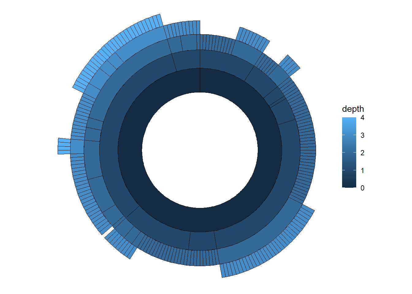
Hive plot
graph <- as_tbl_graph(highschool) %>%
mutate(degree = centrality_degree())
graph <- graph %>%
mutate(friends = ifelse(
centrality_degree(mode = 'in') < 5, 'few',
ifelse(centrality_degree(mode = 'in') >= 15, 'many', 'medium')
))
ggraph(graph, 'hive', axis = friends, sort.by = degree) +
geom_edge_hive(aes(colour = factor(year))) +
geom_axis_hive(aes(colour = friends), size = 2, label = FALSE) +
coord_fixed()## Warning in grid.Call(C_textBounds, as.graphicsAnnot(x$label), x$x, x$y, :
## Windows字体数据库里没有这样的字体系列
## Warning in grid.Call(C_textBounds, as.graphicsAnnot(x$label), x$x, x$y, :
## Windows字体数据库里没有这样的字体系列

## Warning in grid.Call(C_textBounds, as.graphicsAnnot(x$label), x$x, x$y, :
## Windows字体数据库里没有这样的字体系列

## Warning in grid.Call(C_textBounds, as.graphicsAnnot(x$label), x$x, x$y, :
## Windows字体数据库里没有这样的字体系列

## Warning in grid.Call(C_textBounds, as.graphicsAnnot(x$label), x$x, x$y, :
## Windows字体数据库里没有这样的字体系列
## Warning in grid.Call(C_textBounds, as.graphicsAnnot(x$label), x$x, x$y, :
## Windows字体数据库里没有这样的字体系列
## Warning in grid.Call(C_textBounds, as.graphicsAnnot(x$label), x$x, x$y, :
## Windows字体数据库里没有这样的字体系列
## Warning in grid.Call(C_textBounds, as.graphicsAnnot(x$label), x$x, x$y, :
## Windows字体数据库里没有这样的字体系列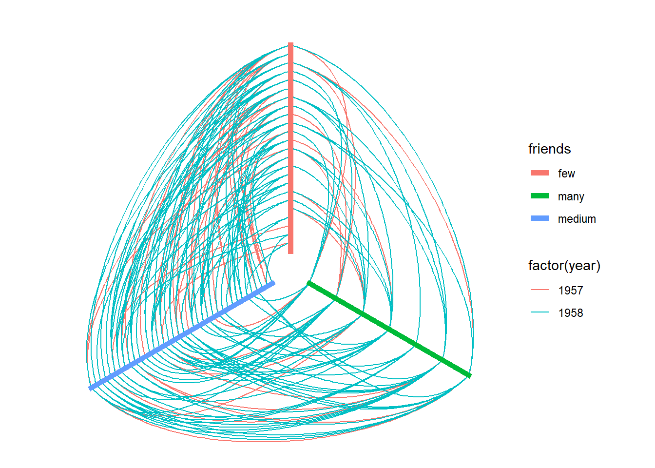
Hierarchical layouts 分层布局
** 关于 flare 数据 **
This dataset contains the graph that describes the class hierarchy for the Flare ActionScript visualization library. It contains both the class hierarchy as well as the import connections between classes. This dataset has been used extensively in the D3.js documentation and examples and are included here to make it easy to redo the examples in ggraph.
graph <- tbl_graph(flare$vertices, flare$edges)
set.seed(1)
ggraph(graph, 'circlepack', weight = size) +
geom_node_circle(aes(fill = depth), size = 0.25, n = 50) +
coord_fixed()## Warning in grid.Call(C_textBounds, as.graphicsAnnot(x$label), x$x, x$y, :
## Windows字体数据库里没有这样的字体系列
## Warning in grid.Call(C_textBounds, as.graphicsAnnot(x$label), x$x, x$y, :
## Windows字体数据库里没有这样的字体系列
## Warning in grid.Call(C_textBounds, as.graphicsAnnot(x$label), x$x, x$y, :
## Windows字体数据库里没有这样的字体系列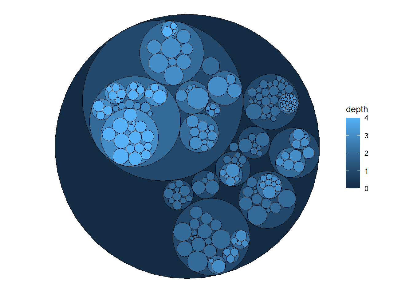
set.seed(1)
ggraph(graph, 'circlepack', weight = size) +
geom_edge_link() +
geom_node_point(aes(colour = depth)) +
coord_fixed()## Warning in grid.Call(C_textBounds, as.graphicsAnnot(x$label), x$x, x$y, :
## Windows字体数据库里没有这样的字体系列
## Warning in grid.Call(C_textBounds, as.graphicsAnnot(x$label), x$x, x$y, :
## Windows字体数据库里没有这样的字体系列
## Warning in grid.Call(C_textBounds, as.graphicsAnnot(x$label), x$x, x$y, :
## Windows字体数据库里没有这样的字体系列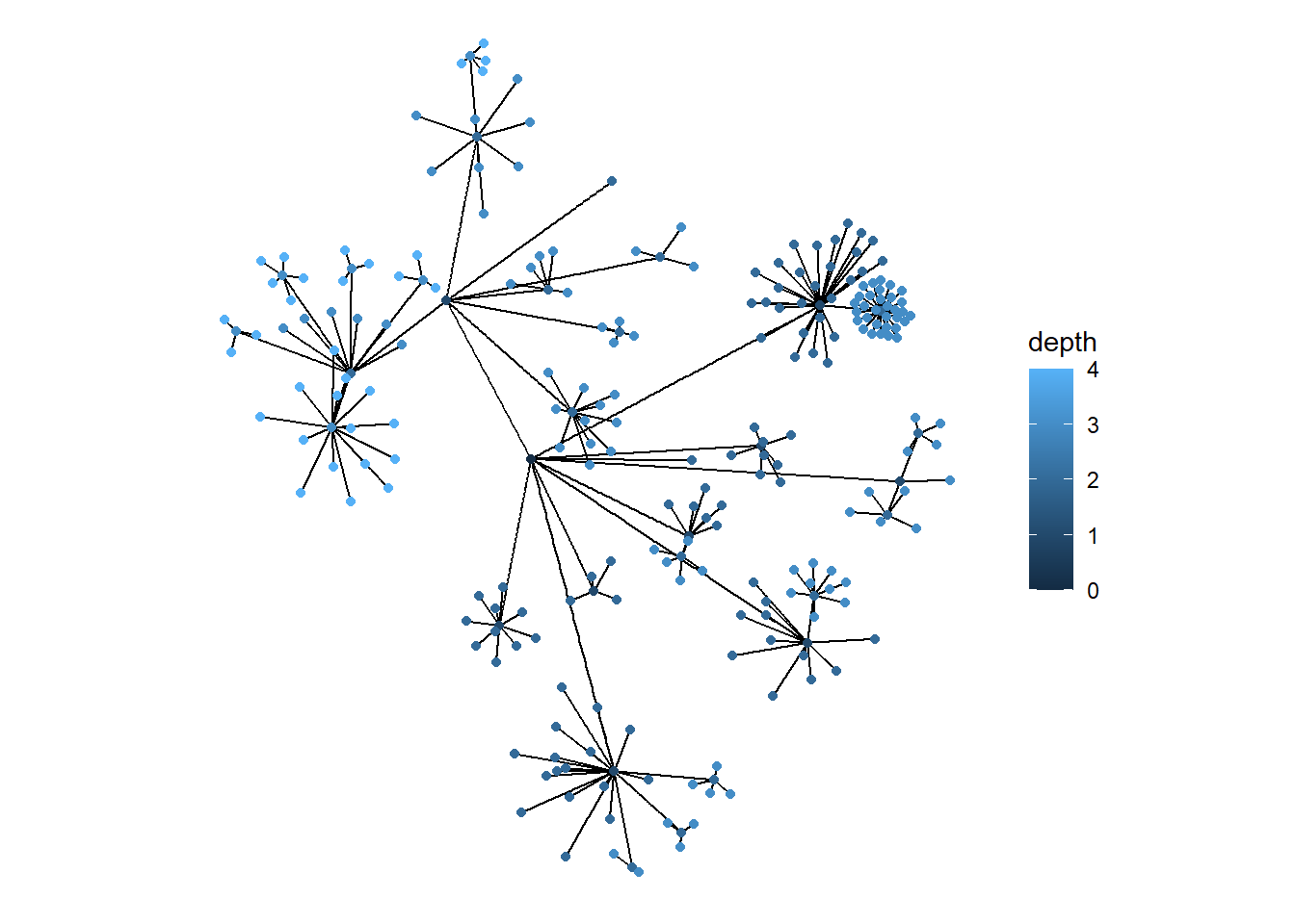
ggraph(graph, 'tree') +
geom_edge_diagonal()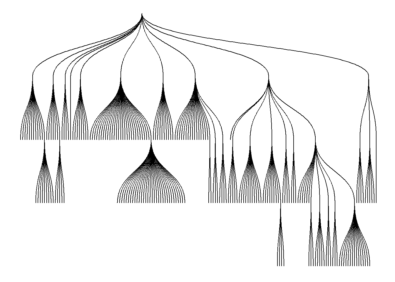
Matrix Layouts 矩阵布局
矩阵布局可以最大程度上减少边的遮盖。
graph <- create_notable('zachary')
ggraph(graph, 'matrix', sort.by = node_rank_leafsort()) +
geom_edge_point(mirror = TRUE) +
coord_fixed()
Nodes 节点
Source:vignettes/Nodes.Rmd
节点不见得一定是点,也可以是片。
gr <- tbl_graph(flare$vertices, flare$edges)
ggraph(gr, layout = 'partition') +
geom_node_tile(aes(y = -y, fill = depth))## Warning in grid.Call(C_textBounds, as.graphicsAnnot(x$label), x$x, x$y, :
## Windows字体数据库里没有这样的字体系列
## Warning in grid.Call(C_textBounds, as.graphicsAnnot(x$label), x$x, x$y, :
## Windows字体数据库里没有这样的字体系列
## Warning in grid.Call(C_textBounds, as.graphicsAnnot(x$label), x$x, x$y, :
## Windows字体数据库里没有这样的字体系列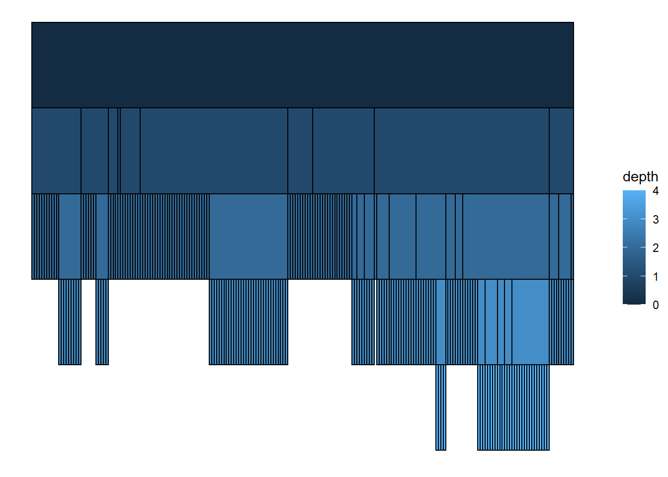
通过对数据进行变换,可以控制上面的图 Y 数值取负数,以及下面的图 只显示叶片。
ggraph(gr, layout = 'dendrogram', circular = TRUE) +
geom_edge_diagonal() +
geom_node_point(aes(filter = leaf)) +
coord_fixed()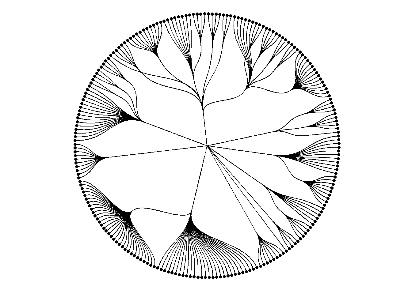
最常用的节点 geoms 是 geom_node_point(), geom_node_text() 和 geom_node_label()。
geom_node_text() 和 geom_node_label() 从 ggrepel 包中取得了 repel 参数,当设为 True 的时候,可以避免文字遮盖。
此外,geom_node_voronio() 也提供了一种避免遮盖的方案。
graph <- create_notable('meredith') %>%
mutate(group = sample(c('A', 'B'), n(), TRUE))
ggraph(graph, 'stress') +
geom_node_voronoi(aes(fill = group), max.radius = 1) +
geom_node_point() +
geom_edge_link() +
coord_fixed()## Warning in grid.Call(C_textBounds, as.graphicsAnnot(x$label), x$x, x$y, :
## Windows字体数据库里没有这样的字体系列
## Warning in grid.Call(C_textBounds, as.graphicsAnnot(x$label), x$x, x$y, :
## Windows字体数据库里没有这样的字体系列

## Warning in grid.Call(C_textBounds, as.graphicsAnnot(x$label), x$x, x$y, :
## Windows字体数据库里没有这样的字体系列

## Warning in grid.Call(C_textBounds, as.graphicsAnnot(x$label), x$x, x$y, :
## Windows字体数据库里没有这样的字体系列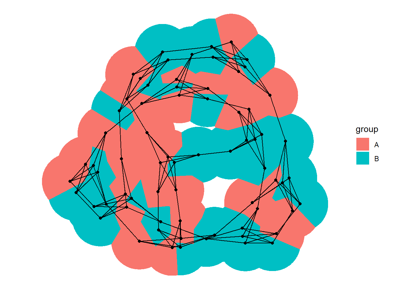
还有一些其它的酷图。
l <- ggraph(gr, layout = 'partition', circular = TRUE)
## 分区表图
l + geom_node_arc_bar(aes(fill = depth)) +
coord_fixed()## Warning in grid.Call(C_textBounds, as.graphicsAnnot(x$label), x$x, x$y, :
## Windows字体数据库里没有这样的字体系列
## Warning in grid.Call(C_textBounds, as.graphicsAnnot(x$label), x$x, x$y, :
## Windows字体数据库里没有这样的字体系列

## Warning in grid.Call(C_textBounds, as.graphicsAnnot(x$label), x$x, x$y, :
## Windows字体数据库里没有这样的字体系列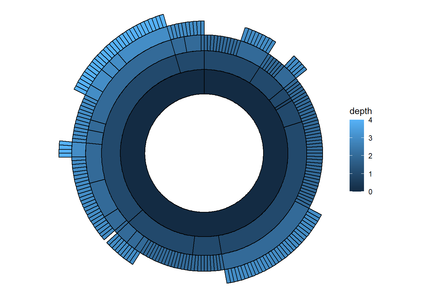
##
l + geom_edge_diagonal() +
geom_node_point(aes(colour = depth)) +
coord_fixed()## Warning in grid.Call(C_textBounds, as.graphicsAnnot(x$label), x$x, x$y, :
## Windows字体数据库里没有这样的字体系列
## Warning in grid.Call(C_textBounds, as.graphicsAnnot(x$label), x$x, x$y, :
## Windows字体数据库里没有这样的字体系列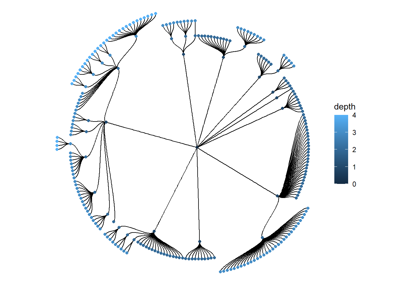
Edges
用作者的话说,“边不仅仅是两个点之间的一条线段”。ggraph 提供了系列函数来进行边的可视化。
首先,准备一下示例数据。
library(ggraph)
library(tidygraph)
library(purrr)
library(rlang)##
## 载入程辑包:'rlang'## The following objects are masked from 'package:purrr':
##
## %@%, as_function, flatten, flatten_chr, flatten_dbl, flatten_int,
## flatten_lgl, flatten_raw, invoke, list_along, modify, prepend,
## spliceset_graph_style(plot_margin = margin(1,1,1,1))
hierarchy <- as_tbl_graph(hclust(dist(iris[, 1:4]))) %>%
mutate(Class = map_bfs_back_chr(node_is_root(), .f = function(node, path, ...) {
if (leaf[node]) {
as.character(iris$Species[as.integer(label[node])])
} else {
species <- unique(unlist(path$result))
if (length(species) == 1) {
species
} else {
NA_character_
}
}
}))
hairball <- as_tbl_graph(highschool) %>%
mutate(
year_pop = map_local(mode = 'in', .f = function(neighborhood, ...) {
neighborhood %E>% pull(year) %>% table() %>% sort(decreasing = TRUE)
}),
pop_devel = map_chr(year_pop, function(pop) {
if (length(pop) == 0 || length(unique(pop)) == 1) return('unchanged')
switch(names(pop)[which.max(pop)],
'1957' = 'decreased',
'1958' = 'increased')
}),
popularity = map_dbl(year_pop, ~ .[1]) %|% 0
) %>%
activate(edges) %>%
mutate(year = as.character(year))常规类型
## 纺锤体
ggraph(hairball, layout = 'stress') +
geom_edge_fan(aes(colour = year))## Warning in grid.Call(C_textBounds, as.graphicsAnnot(x$label), x$x, x$y, :
## Windows字体数据库里没有这样的字体系列
## Warning in grid.Call(C_textBounds, as.graphicsAnnot(x$label), x$x, x$y, :
## Windows字体数据库里没有这样的字体系列

## Warning in grid.Call(C_textBounds, as.graphicsAnnot(x$label), x$x, x$y, :
## Windows字体数据库里没有这样的字体系列
## Warning in grid.Call(C_textBounds, as.graphicsAnnot(x$label), x$x, x$y, :
## Windows字体数据库里没有这样的字体系列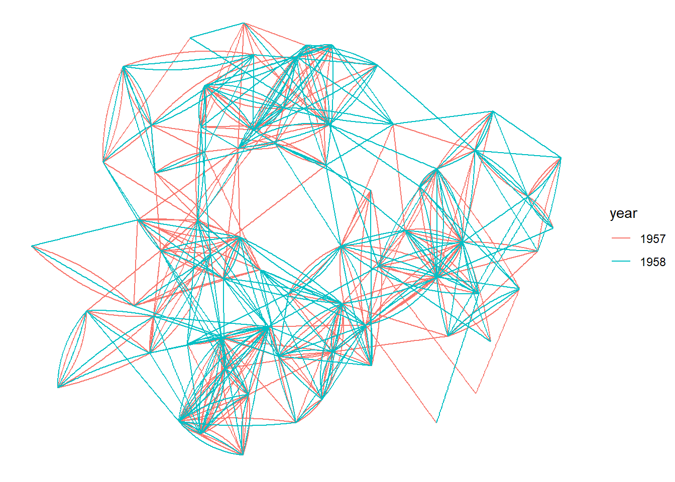
## 平行宇宙
# let's make some of the student love themselves
loopy_hairball <- hairball %>%
bind_edges(tibble::tibble(from = 1:5, to = 1:5, year = rep('1957', 5)))
ggraph(loopy_hairball, layout = 'stress') +
geom_edge_link(aes(colour = year), alpha = 0.25) +
geom_edge_loop(aes(colour = year))## Warning in grid.Call(C_textBounds, as.graphicsAnnot(x$label), x$x, x$y, :
## Windows字体数据库里没有这样的字体系列
## Warning in grid.Call(C_textBounds, as.graphicsAnnot(x$label), x$x, x$y, :
## Windows字体数据库里没有这样的字体系列

## Warning in grid.Call(C_textBounds, as.graphicsAnnot(x$label), x$x, x$y, :
## Windows字体数据库里没有这样的字体系列

## Warning in grid.Call(C_textBounds, as.graphicsAnnot(x$label), x$x, x$y, :
## Windows字体数据库里没有这样的字体系列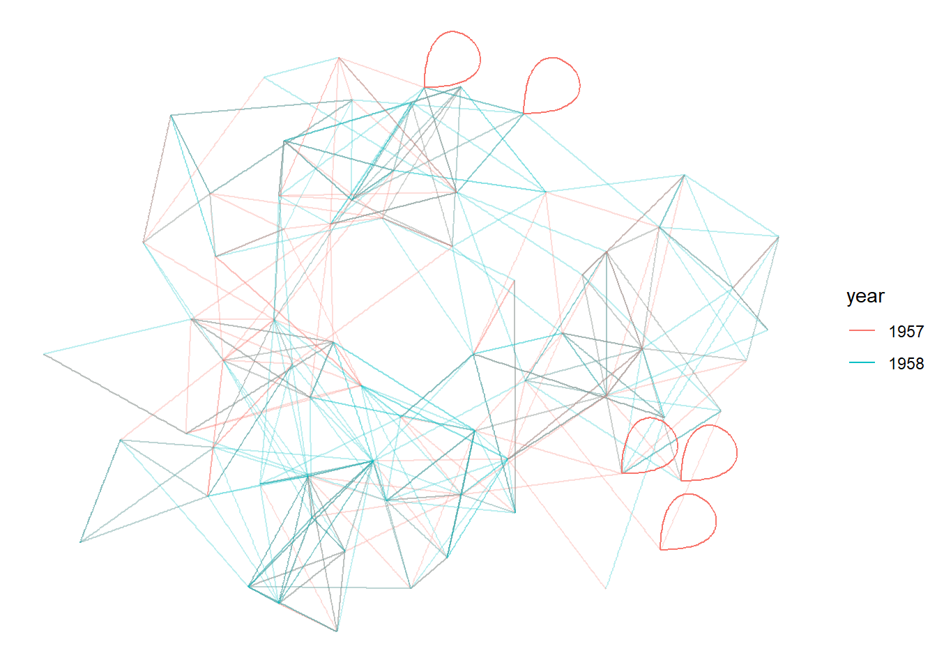
## 密度图
ggraph(hairball, layout = 'stress') +
geom_edge_density(aes(fill = year)) +
geom_edge_link(alpha = 0.25)## Warning in grid.Call(C_textBounds, as.graphicsAnnot(x$label), x$x, x$y, :
## Windows字体数据库里没有这样的字体系列
## Warning in grid.Call(C_textBounds, as.graphicsAnnot(x$label), x$x, x$y, :
## Windows字体数据库里没有这样的字体系列

## Warning in grid.Call(C_textBounds, as.graphicsAnnot(x$label), x$x, x$y, :
## Windows字体数据库里没有这样的字体系列

## Warning in grid.Call(C_textBounds, as.graphicsAnnot(x$label), x$x, x$y, :
## Windows字体数据库里没有这样的字体系列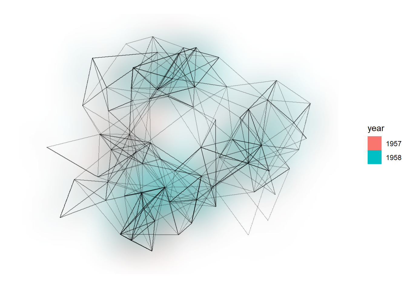
关于上面的密度图,可以显示边类型的密度。在上面的图中,如果 1957 年的居多,则显示为偏红色;如果 1958 年的居多,则显示为偏蓝色。
斜纹和对角线
## Diagonals
ggraph(hierarchy, layout = 'dendrogram', height = height) +
  geom_edge_diagonal()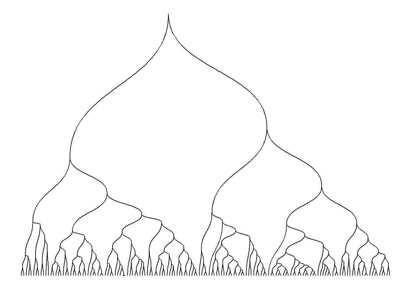
## Bends
ggraph(hierarchy, layout = 'dendrogram', height = height) +
  geom_edge_bend()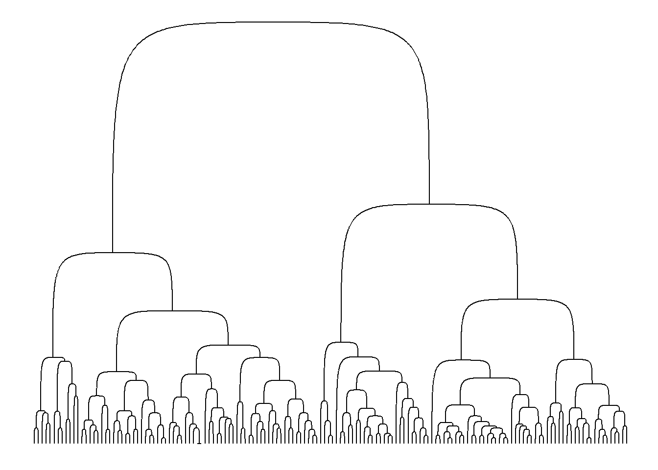
设定边的细节
- 使用箭头。
- 使用贝塞尔曲线
- 使用标签文字
Connections
Connections 不是边,但可以用来把 节点 连起来。
支持的数据类型
要生成一个图,需要的关系型数据在 R 中有很多形式。ggraph 是在 tidygraph 包的基础上开发的,后者大部分数据结构在 ggraph 中都是原生支持的。对于新的数据类型,要想获得 ggraph 的支持,只需要扩展支持一个 as_tbl_graph 方法即可。
相关包
ggdendro: supportdendrogram&hclustggtree: support tree-ralatedggnetwork:geomnet:GGally:
函数速查
详见:Reference
Plot Construction
ggraph()create_layout()
Layouts
布局在 ggraph() 中指定,或者通过 creat_layout() 计算。
layout_tbl_graph_auto()layout_tbl_graph_stress()layout_tbl_graph_backbone()layout_tbl_graph_*(), Others.
Nodes
geom_node_point()Show nodes as points
geom_node_text()geom_node_label()Annotate nodes with text
geom_node_tile()Draw the rectangles in a treemap
geom_node_voronoi()Show nodes as voronoi tiles
geom_node_circle()Show nodes as circles
geom_node_arc_bar()Show nodes as thick arcs
geom_node_range()Show nodes as a line spanning a horizontal range
Edges
geom_edge_link()geom_edge_link2()geom_edge_link0()Draw edges as straight lines between nodes
geom_edge_arc()geom_edge_arc2()geom_edge_arc0()Draw edges as Arcs
geom_edge_parallel()geom_edge_parallel2()geom_edge_parallel0()Draw multi edges as parallel lines
geom_edge_fan()geom_edge_fan2()geom_edge_fan0()Draw edges as curves of different curvature
geom_edge_loop()geom_edge_loop0()Draw edges as diagonals
geom_edge_diagonal()geom_edge_diagonal2()geom_edge_diagonal0()Draw edges as diagonals
geom_edge_elbow()geom_edge_elbow2()geom_edge_elbow0()Draw edges as elbows
geom_edge_bend()geom_edge_bend2()geom_edge_bend0()Draw edges as diagonals
geom_edge_hive()geom_edge_hive2()geom_edge_hive0()Draw edges in hive plots
geom_edge_span()geom_edge_span2()geom_edge_span0()Draw edges as vertical spans
geom_edge_point()Draw edges as glyphs
geom_edge_tile()Draw edges as glyphs
geom_edge_density()Show edges as a density map
Connections
Connections are meta-edges, connecting nodes that are not direct neighbors, either through their shortest path or directly.
geom_conn_bundle()geom_conn_bundle2()geom_conn_bundle0()Create hierarchical edge bundles between node connections
Facets
Faceting with networks is a bit different than for tabular data, as you’d often want to facet only nodes, or edges etc.
facet_graph()Create a grid of small multiples by node and/or edge attributes
facet_nodes()Create small multiples based on node attributes
facet_edges()Create small multiples based on edge attributes
Scales
While nodes uses the standard scales provided by ggplot2, edges have their own, allowing you to have different scaling for nodes and edges.
scale_edge_colour_*(): Edge colorscale_edge_fill_*(): Edge fillscale_edge_alpha*(): Edge alphascale_edge_width_*(): Edge widthscale_edge_size_*(): Edge sizescale_edge_lintype*():scale_edge_shape*()scale_label_size*(): Edge label size